


According to Norman Shaw, the COVID-19 pandemic has led to a surge in online shopping, making a strong online presence crucial for businesses. Today, every business needs a website that not only looks good but also sells effectively. Yet, building a user-friendly and successful website remains a tricky endeavor. So, what steps should be taken to create a robust e-commerce webpage?
First things first, create a smooth buying experience, starting from when visitors land on the page until they complete a purchase and even afterward. Make sure to design a user-friendly flow where each step brings customers closer to buying.
As the website designer, your aim is to make it easy for users to move from one step to the next, reducing any hurdles along the way. To make things easier, focus on each step of the buying process. We've gathered top tips for every stage to simplify the design process.
Part 1: Header
Easy Country and Language Selection: Either automatically detect the location or provide a simple selector in a pop-up for choosing country and language preferences.

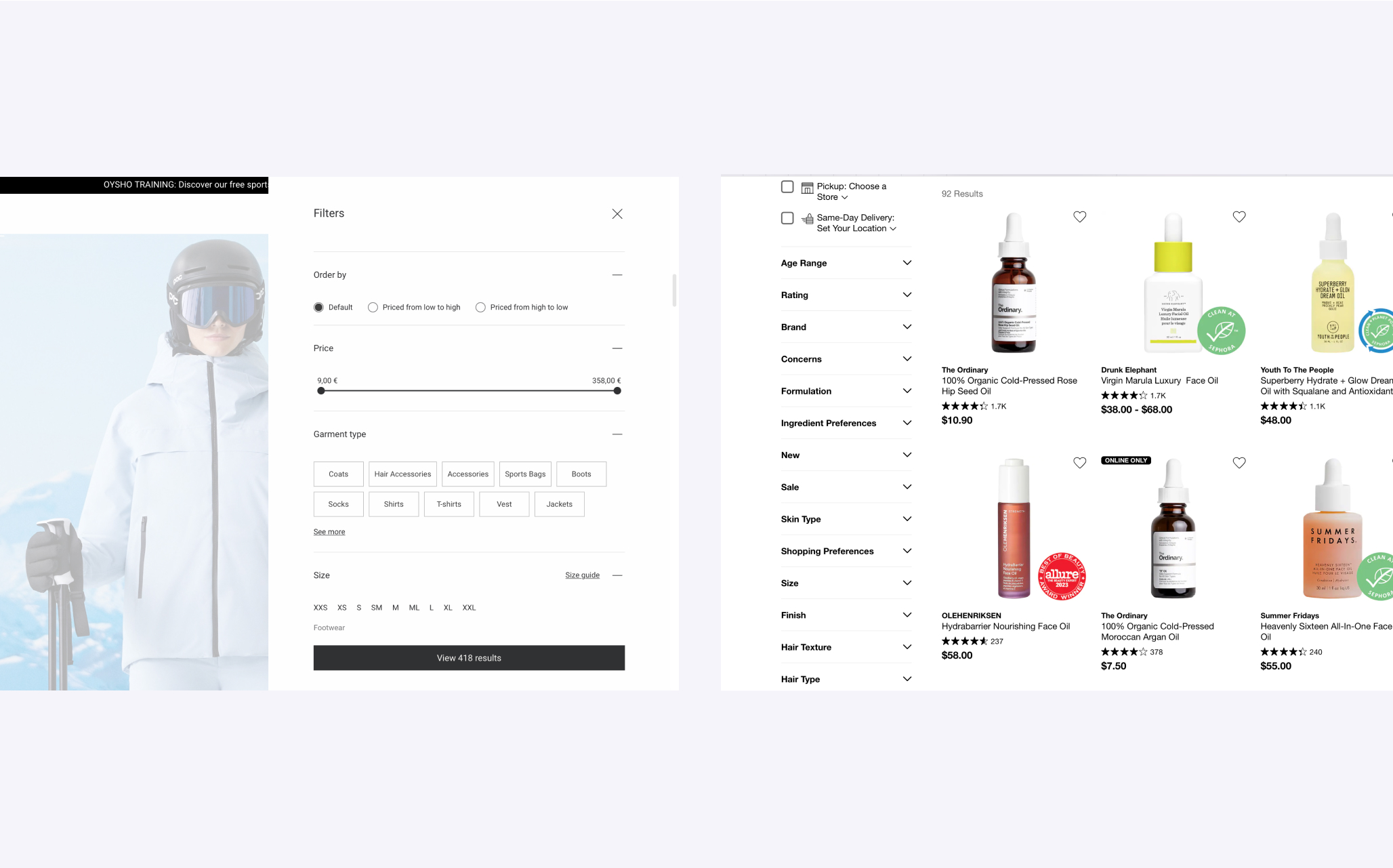
Improved Search: Keep it simple—make sure customers can easily find what they want by having a search function that works well.
Breadcrumbs for Navigation: Turn on breadcrumbs on product pages. They help users go back to different categories, like an expanded search feature.
User-Friendly Menu: Use dropdowns with sub-categories for your products. Keep it clear by using general terms to organize items.
Smart Cart Icon: Show the number of items added on the cart icon at all times. Clicking it takes users back to the cart and checkout. You can go a step further by letting users preview their cart when they hover over the icon.
Sticky Header for Easy Navigation: Pin the header so it stays visible when users scroll. This reduces the need for excessive scrolling to find the search or navigation, making it easier for users.

Part 2: Home Page
The homepage is like your main info hub—it's where you find out about the company, what's up for grabs, what's in stock, and how to get around. Plus, it's a big player in getting noticed on search engines (SEO) and making the brand look good in marketing.
Think of the homepage as a virtual fishing line, luring in visitors to check things out and maybe make a purchase. It's the first face of the brand, making a lasting impression and giving a visual vibe. The goal? Keep visitors interested and encourage them to keep clicking around. It's not just a static start; it's a dynamic space that invites people to join in and explore.
To enhance the homepage further:
Optimize Entry Points: Beneath the main banner, consider a section showcasing hot offers, promotions, discounts, and popular items in the affordable to mid-price range, capturing the visitor's attention.
Leverage Hero Product Imagery: Capitalize on the power of visual processing by incorporating hero product photos on the homepage or in a carousel. These images swiftly convey your main value proposition, engaging new visitors and generating excitement about your offerings.
Promote User-Generated Content: Harness the influence of word-of-mouth marketing through user-generated content (UGC). Encourage customers to create and share content that reflects their satisfaction with your products or services, fostering a sense of community.
Spotlight Best Sellers: While your homepage isn't a product listing, strategically feature your best-selling items. Consider this as showcasing the products you'd place in your shop window, whether they are consistently popular or tied to specific holidays, events, or seasons.
Enhance Viewing History: Personalize the user experience by incorporating a viewing history section. This could include displaying products similar to those previously viewed, items from the same brand, or complementary products, creating a tailored and engaging browsing experience.

Part 3: Catalog
Clear Categories: Make sure the main menu shows all the categories the site offers. Group products logically into categories and subcategories.
Quick Preview Option: Improve how products are shown on category pages by adding a "Quick Preview" feature. This saves shoppers from having to open multiple tabs or switch back and forth between pages, especially on mobile devices.
Sort and Filter Easily: Let shoppers sort search results by best sellers, price, rating, and newest items. Allow them to filter out items that don't fit in a specific category. Keep filters organized based on what's popular, especially on mobile, and show the number of products for each filter. Make it easy for users to clear selected filters all at once.
Highlight Popular Picks and Reviews: Make it easy for customers to spot the products that others love by featuring popular items prominently or giving them a dedicated section with reviews.
Display Stock Availability: Keep customers informed about stock levels right on the listing page. This prevents frustration later, especially if an item is out of stock during checkout.
Browsable product photos in product pods: Streamline the experience for users. Allow them to browse through all product photos directly on the listing page using interactive product pods. It's quick, convenient, and enhances the overall shopping experience.
Innovative Faux Product Pods: Introduce creative "faux" product pods strategically. Use them to advertise other categories, convey messages, or provide additional information about the product category users are exploring. This adds depth and interest to the browsing experience.
Part 4: Product Page
Use Great Product Images: Show the product from different angles and throw in some close-ups. Videos work wonders too, providing lots of info in a short time.
Give Enough Product Info: Tell shoppers everything they need to know—availability, size options, colors, dimensions, materials, total cost, warranties, and more. The clearer the details, the more likely they are to buy.
Highlight Customer Reviews: Make reviews easy to find and enjoyable to read. Add starred ratings, use a readable font, and show the average score. Clearly separate positive and negative reviews, and share relevant details about the reviewer.
Suggest Similar Products: Show other products that go well with the one they're checking out, or items that others often buy together. It's a helpful way to keep shoppers interested and might lead them to buy more.

Part 5: Cart
Give Clear Confirmation: When someone adds a product to the cart, make sure they get a clear and immediate confirmation. Avoid confusing them with small, easy-to-miss messages. Consider using animations since they grab attention.
Use a Mini Cart Widget: Let shoppers add things to their cart without leaving the page with a mini cart. It's handy for exploring more products. Just make sure it links to the full cart page.
Show Product Details in the Cart: Put product names, images, sizes, colors, and prices in the cart. This helps shoppers remember what they added and compare items easily. Don't forget to link back to the full product pages.
Make Cart Changes Simple: Allow easy edits in the cart. People should be able to remove items, save them for later, or tweak things like size and color without any hassle.
Be Transparent About Costs: Avoid surprising shoppers with unexpected shipping costs and taxes. Clearly show shipping options, give accurate cost breakdowns, and mention expected delivery dates upfront.
Improve Empty Cart Messages: Instead of just saying the cart is empty, invite users to add something. Use clear prompts or shopping tips, and maybe suggest some products to make it more interesting for them.

Part 6: Checkout
Make Registration Optional: Don't make shoppers create an account before making their first purchase; it can turn them away. Allow them to register after completing the purchase, emphasizing the benefits of registration at that point.
Keep It Simple: Simplify the process by minimizing fields and steps for the purchase. Defaulting to using the shipping address as the billing address can reduce the number of fields. Aim for a single-page checkout where shoppers can review their cart and input delivery and payment details.
Offer Various Payment Options: Accommodate diverse payment preferences to attract a broader customer base. Provide multiple payment options (based on the target audience) to make the ordering process convenient for all shoppers.
Use Clear Error Indications: Ensure error messages are clear and concise, positioned directly above or next to the item requiring correction. This ensures shoppers easily notice and understand the corrections needed.
Keep Shoppers on Track: If using a multi-page checkout, incorporate a progress bar indicating the number of steps remaining. Once the purchase is complete, display an order confirmation along with order status and shipment tracking details.
Highlight Site Security: Beyond the HTTPS certificate, include a link in the cart that allows curious users to read a more detailed explanation of how security is maintained on your site.

Summary
In conclusion, navigating the ever-evolving landscape of e-commerce requires a strategic blend of functionality, aesthetics, and user-centric design. By prioritizing a smooth buying journey, optimizing each webpage element, and embracing innovation, businesses can not only capture attention but also foster lasting connections with their audience. So, whether it's enhancing the homepage allure, simplifying the checkout process, or creatively utilizing faux product pods, the key lies in a holistic approach that transforms every click into a confident purchase. Here's to crafting not just websites but seamless and delightful online shopping experiences. Cheers!


